Welcome to our humble home!
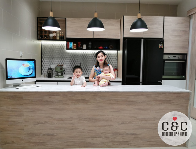
Pride of ownership is the number one reason why we yearn to own our home. It means you can paint the walls any colour you desire, turn your music up, attach permanent fixtures, and decorate your home according to your own taste!

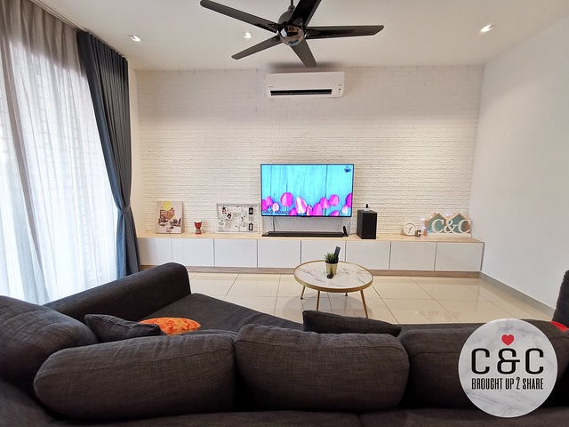
We only started renovating our house one year after getting the keys. Yes, we’ve been slacking a bit haha. And right after we found out I’m pregnant with MiniC2, everything has to be turbo-ed. And thank god – we managed to pull it off, 2 weeks before Mini C2 is out! Super grateful that Papa C has been very dedicated, visiting the site himself as I can’t go anywhere near it while they were working on the house (Pregnancy Taboos). While I’m the one who “supervises” via FaceTime and confirming designs + colour schemes. LOL.
I’ve pinterest everything we love for quite sometime – mainly Scandinavian themed, black, grey, white with shades of wood (simple and clean is good!). But when it comes to planning the real layout and to liase with different contractors, it was a pain in the neck just to think about it.

It is definitely a good idea to hire interior designers, if you have invested quite a bit of money for the house. The main purpose of interior designers is to make the place look good and pleasing both aesthetically and functionally. Moreover, decorators know how to make the house look attractive based on the personality and needs of their client.
And ours was done by Re Urban Design & Build
All I need to do is to send those pictures I’ve pinned to my interior designer, discussed with her about our interests and lifestyle, and she came up with the drafts of 3D designs.
It’s all about choices and decisions and they also helped me in accessing and arranging materials, as we do not have time for arranging the house according to our styles and desires due to your work and busy schedule. Choosing materials, paint colours and how to match etc.

And what we personally love most?
The surprise element
Most of the interior designers, like ours, tend to think outside of the box and try to think about ways to improve the house and make it more appealing. This results in an addition to a wow factor in the final product. They will help you to look things differently and in an artistic manner. They will add an aesthetic factor to the overall look of the house.
As we were on a budget, we focused on 3 main areas of the house:
Living Hall
Kitchen
Master Bedroom


The Details:
Dry Kitchen
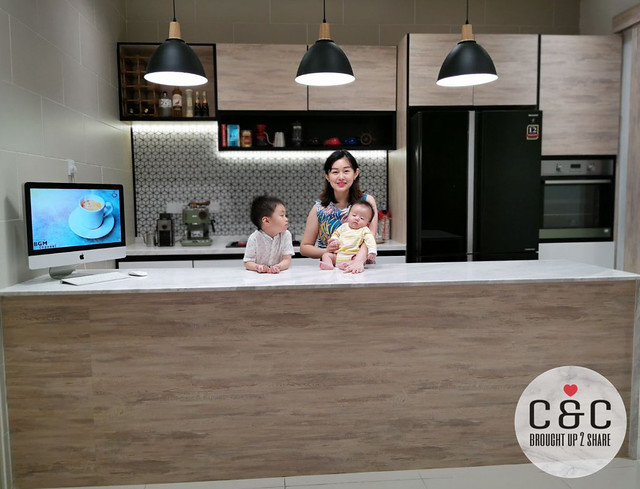
This is the place where we hung out the most. Whether it’s family & friends gatherings, intimate or bigger parties! And thus – sleek, modern and most importantly a comfortable outlook is what we look for.
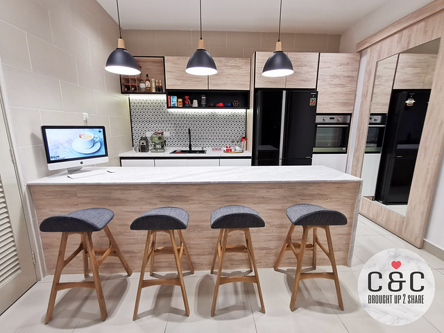
A mirror on our sliding door to project more space. This door is the entrance to our wet kitchen.

We have storages beneath as well.

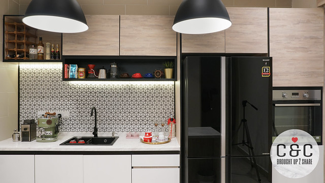
More storages at the top


Sorry, I’m a marble fan. Haha.
Wet Kitchen
Welcome to Papa C’s soul . LOL
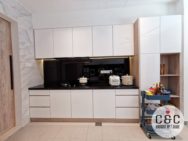
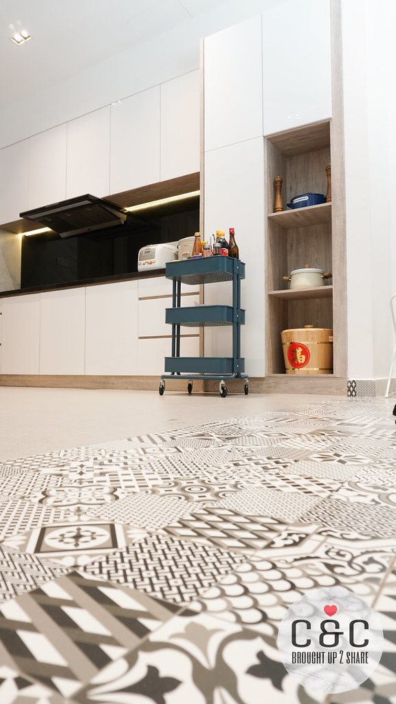
The important space to feed the family!
White is the highlight here!
Using 4G Acrylic for our cabinets and Cabossa Oak for the tall cabinet next to the entrance.
And again, some marble print at one of the walls.

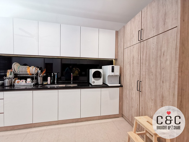

Well, we didn’t put ’em right on top of the floor of course. Haha.
Wooden blind from Curtain Culture
Living Area

And a whole stretch of cabinets for storage.

Also from MORE Design 🙂
Big shoutout to our Curtain vendor: Curtain Culture for their amazing services, professional advise and high quality curtains!


From TaoBao
TaoBao Link for Marble Gold Table: https://tinyurl.com/yy2mrl6q
Dining Area
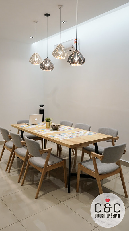
All from MORE Design

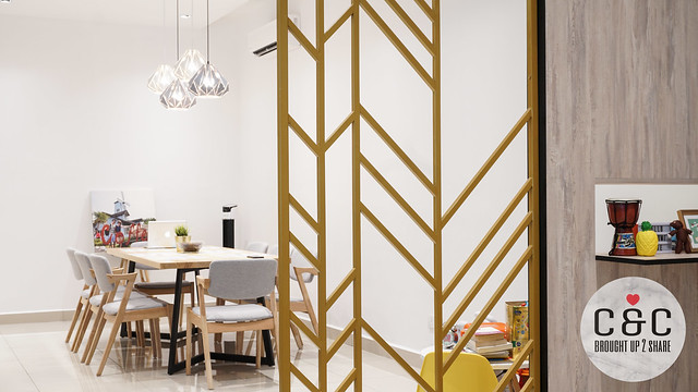
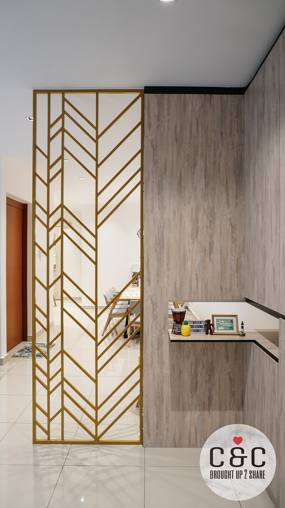
Entrance

First Floor Family Area
Mini C loves books and we’ve been imagining a reading area for our kids in the future. So here goes!
All these cabinets are from TaoBao and assembled by Papa C himself! Power! LOL.
Love the sofa from Flexis Haus – they specialise in custom-making the sofa of your choice! We chose the size, material, colour & design ourselves! Will be sharing more about Flexi Haus soon!
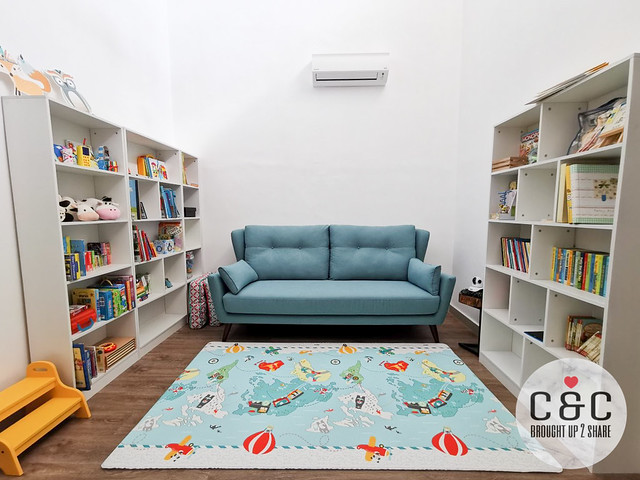
TaoBao link for White Bookshelves: https://tinyurl.com/yy6qecrj
Playmat from Skip Hop : Bloom & Grow Asia
Master Bedroom
Also using Cabossa Oak, they did a bed head, that stretches to become a divider from the main door, also a bookshelf for me!

Vinyl Flooring from Coco Floor
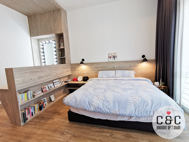

TaoBao Link for Rose Gold side table: https://preview.tinyurl.com/y3shguqh

And We loved the wooden panel that connects my vanity area to the opposite wardrobe so much! Loving the details done with Cabossa Oak.
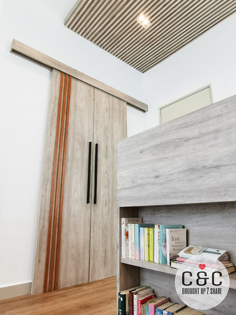

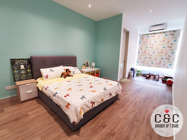
Mini C’s Room
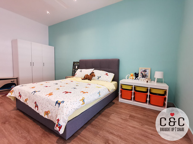
Horse bedsheet from TaoBao
Mini C2’s room
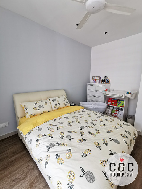
Plan to use this room for Mini C2 later on so now it has become our baby room at the moment. Just keeping it simple with a drawer, changing table (both from IKEA) and a Baby Cot!
I did my confinement here btw 🙂

That’s the end of the “tour” to our humble adobe. Still haven’t put up the paintings and pictures on our wall yet so it looked quite empty. Haha.
Nonetheless, this is one space that we look forward going back to everyday after a long day of work!
ID – Re Urban Design & Build: https://www.facebook.com/reurbandesignlab/
Curtain – Curtain Culture:
https://www.facebook.com/curtainculture/
Vinyl Flooring – Coco Floor:
https://www.facebook.com/cocofloormalaysia/
First Floor Living Area Sofa – Flexihaus : https://www.facebook.com/flexihaus/

So Beautiful!!! The colours match you so well!
Thank you Ally!! <3
Nice wide angle work! Also the computer at kitchen for recipe & youtube cooking show? haha.
Thanks KY! and Yes! mainly for recipes and cooking shows haha.
And when my boy wants to take over my TV when i needed to watch mine, I’ll let him watch on this PC instead lol.
A distraction hahah