Let’s face it.
Anybody can make a business/ name card.
But very few people create the perfect business card for their unique needs.
What do I mean by that?
What’s so difficult about printing your name, your job title, and your contact information on a small piece of paper?
Nothing really.
And most people have a mediocre card that get the job done.
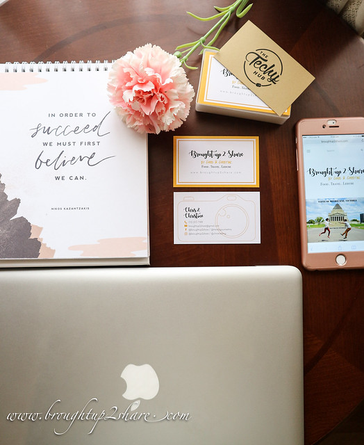
But the Techy Hub’s goal isn’t for us to settle for mediocre. They wanted to give us a business card that makes us referable, that ensures weu are remembered, and does its job to perfection.
I want you to have the perfect business card for you – The Techy Hub
The Techy Hub also did a makeover for our website! Read all about it HERE!
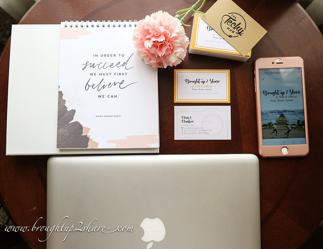
They did our name card design, understood our needs and what are supposed to be included & got them printed within the same day by http://expodigital.com.my/
Super efficient.
Here are 4 Tips to Create the Perfect Business Card!
1. Understand the purpose of your business card
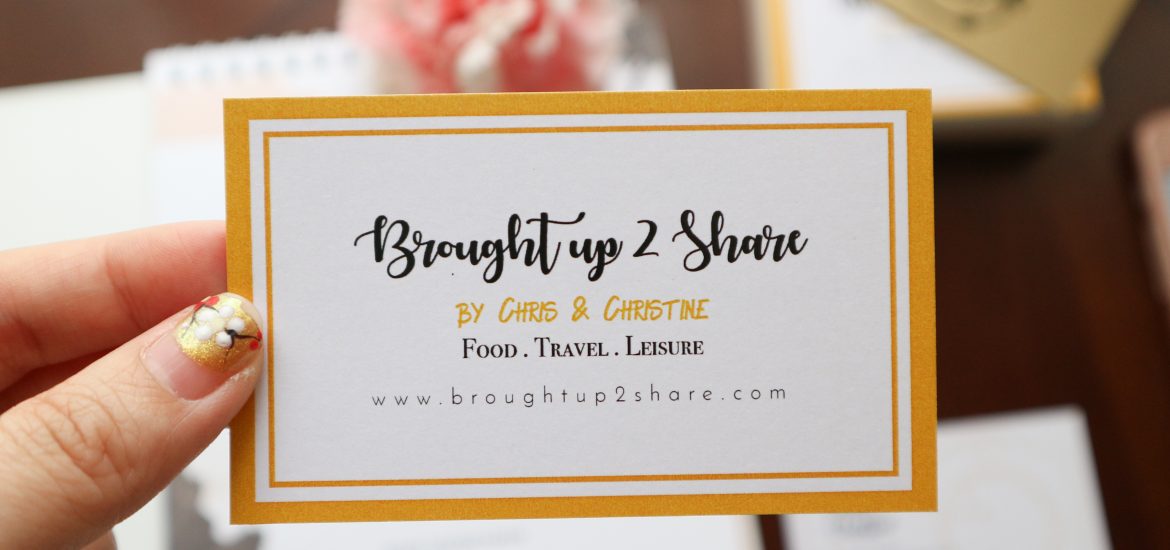
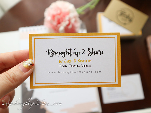
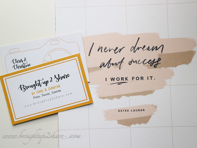
The way a business card looks as well as the information written on it is very dependent on what the card owner wants it to do. Like for our case, we want it to look like the layout of our blog. And thus, the header/logo of our site is printed on the first page.
A better strategy is to have new business cards made (we had ours newly designed by The Techy Hub) – ones that highlight a few of your special skills.
Well, It is certainly not a good idea to squeeze one’s resume in that small space but you still want enough information on there to create a positive first impression.
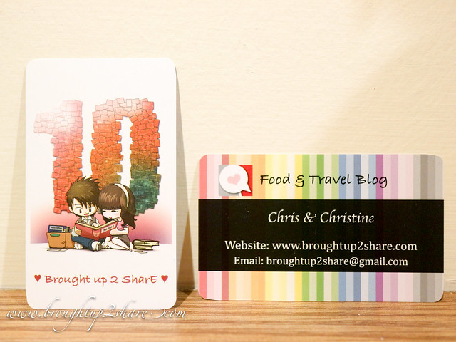
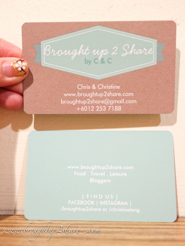
This is our first name card! Where we still blog at the old URL.
I designed it LOL. With the C&C cartoon graphic drawn by my friend. Looks pretty childish eh? *ROFL*
We were still very young and still studying and thus the lack of professionalism.
After we changed our domain to DOT COM.
Still very fancy, colourful and acting cute! LOL! Cos our previous blog design was pretty colourful haha!
2. Keep your business card simple
Make sure that your business card is readable. Stay away from card formats that have so much clutter that it makes it impossible to see where one piece of information starts and ends. Also, use a readable font as not everyone has perfect vision. Haha.
Our previous name card, also designed by myself using some free template online. Very small fonts and the colour combination was kinda terrible. And not everyone can read the infos I think.
3. Make sure the contact information in your business card is accurate
A business card with inaccurate information is useless. Include several options on how people can reach you – some people prefer using the phone still for talking r whatsapp-ing, rather than email. And thus, we’ve included our contact back in, this round.
4. Keep your business card professional
One factor in being professional is your email address. You may be one of those people with funny or unusual ones. Keeping this kind of email is a personal choice of yours but finding something like sexyguy57@hotmail.com doesn’t exactly send the most professional message. Oops.
Another way to keep your business card professional is to make sure that it is clean, free of smudges & not too fancy. Don’t make it seem like your business card has lived in your back pocket for ages.
Ta-Da! Professional enough?
The Techy Hub will be offering FREE DESIGN if you order & purchase 10 boxes of Business Cards.
One can change Name/ Contact details for the same design
Ours is priced at RM25/ box of 100 pieces.
Reasonable and we’ve loving them.
For more info, check out The Techy Hub on http://thetechyhub.com/

